Local Business Website Re-Design:
Vancouver Laptops
Context:
Vancouver Laptops is a small local business in Vancouver, British Columbia that buys and sells secondhand and refurbished laptops.
Vancouver Laptops was searching for designers and wanted to know how each designer would improve their logo and website based on their own perception, insight, and style with no constraints.
As the UI/UX Designer, my purpose in this project is to re-imagine and re-design the official website in ways in which I believe can benefit the business and bring a better user experience to customers that visit the site.
Duration:
1 Week
Team:
Independent
Role:
UIUX Designer
Tools:
Figma
Method:
Comparing and analyzing the user interface, design conventions, and user flows of competitors in the market.
Logo Re-Design
Current Logo

While the current logo consists of a computer chip, it feels more like a hardware store that sells computer parts, rather than refurbished laptops.


My first step was to look for inspiration, so I turned to Looka.com to generate ideas. I decided to keep the original brand colour purple to maintain consistency and brand awareness. Out of a long list of potential designs generated, I picked two logos that caught my eyes, each with a different element I liked.
I liked the style of text of the font in the first logo, and I liked the computer element in the icon of the second logo.
Vancouver Laptops
By combining the two, this is the new logo I created for the Vancouver Laptops redesign challenge.
Website Analysis
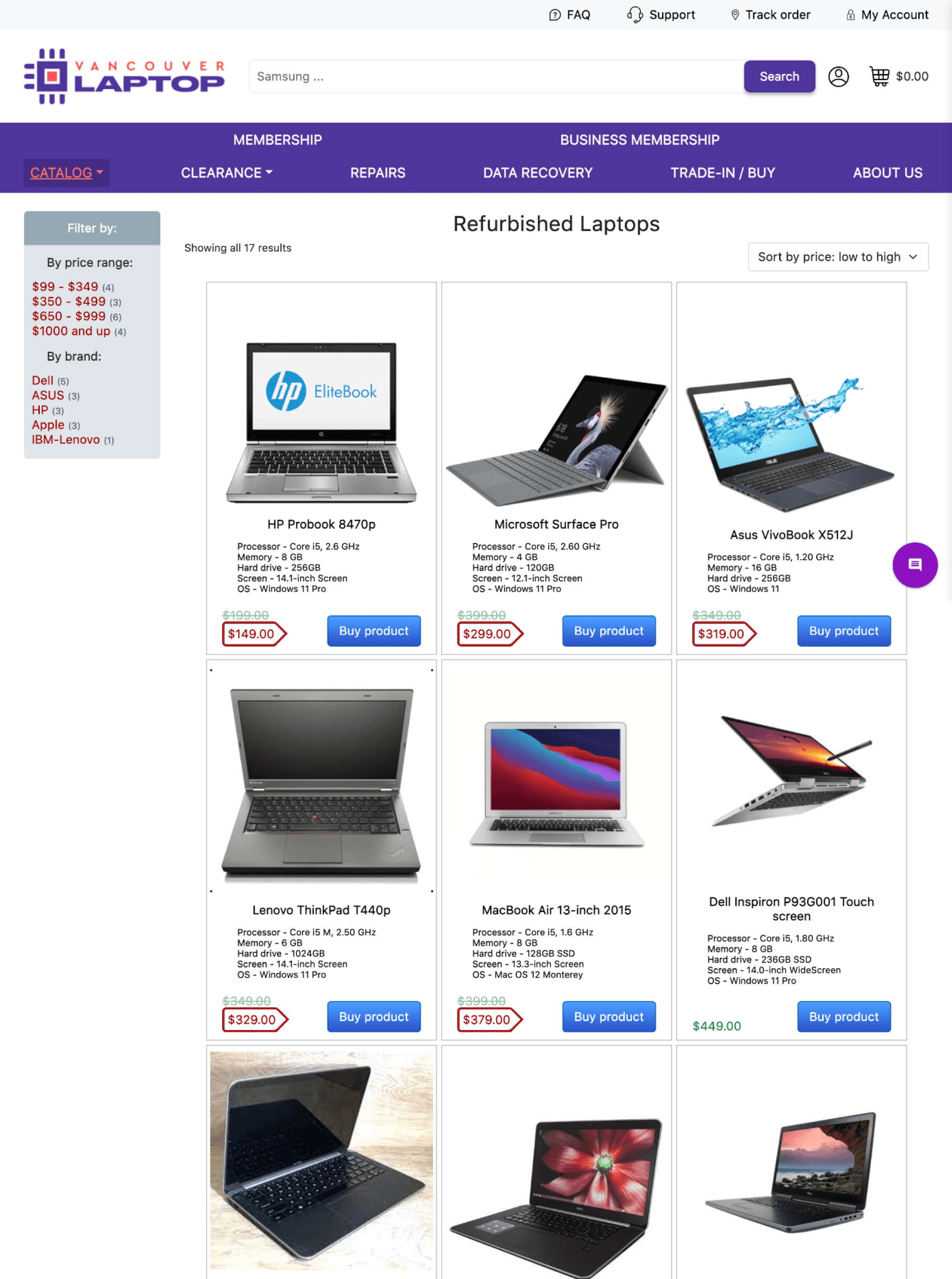
Upon analyzing the current home/catalog page and product page from a consumer’s point of view and as a designer, I knew I wanted to make changes for:
A more detailed placeholder text in the search bar.
Adjust spacing throughout the page.
Simplify product cards.
Simplify top navigation bar.
In addition to my own ideation process to improve website usability and interface design, I also decided to look at several other business’ websites to look for design conventions, and to adapt designs that work well for them.
Competitor Website Analysis
The first competitor I wanted to analyze was Best Buy, as they are one of the most popular and well known electronic stores, who not only sells new products, but refurbished products as well. For each page I visited, I noted down some of the inspirations I took.
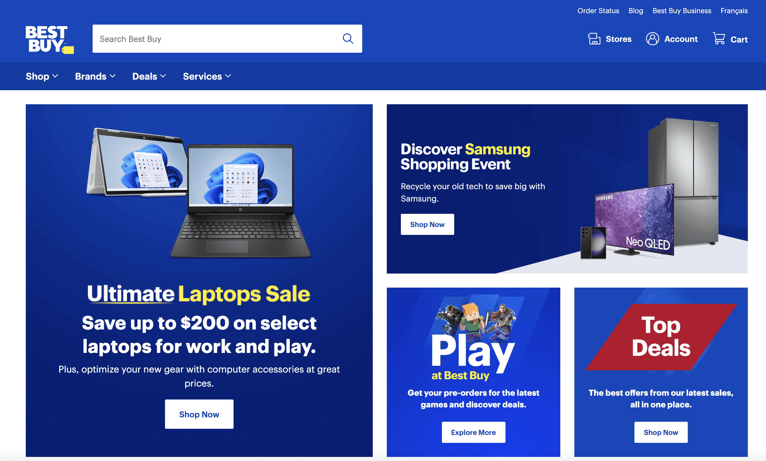
Hero section with sales, promotions, and offers to guide the consumer.
Clean up and unify the navigation top bar, aligned to the left.
Responsive web, but generally maintaining four products per line in the catalog.
Product card details made more organized.
Filter side bar made more structured and organized.
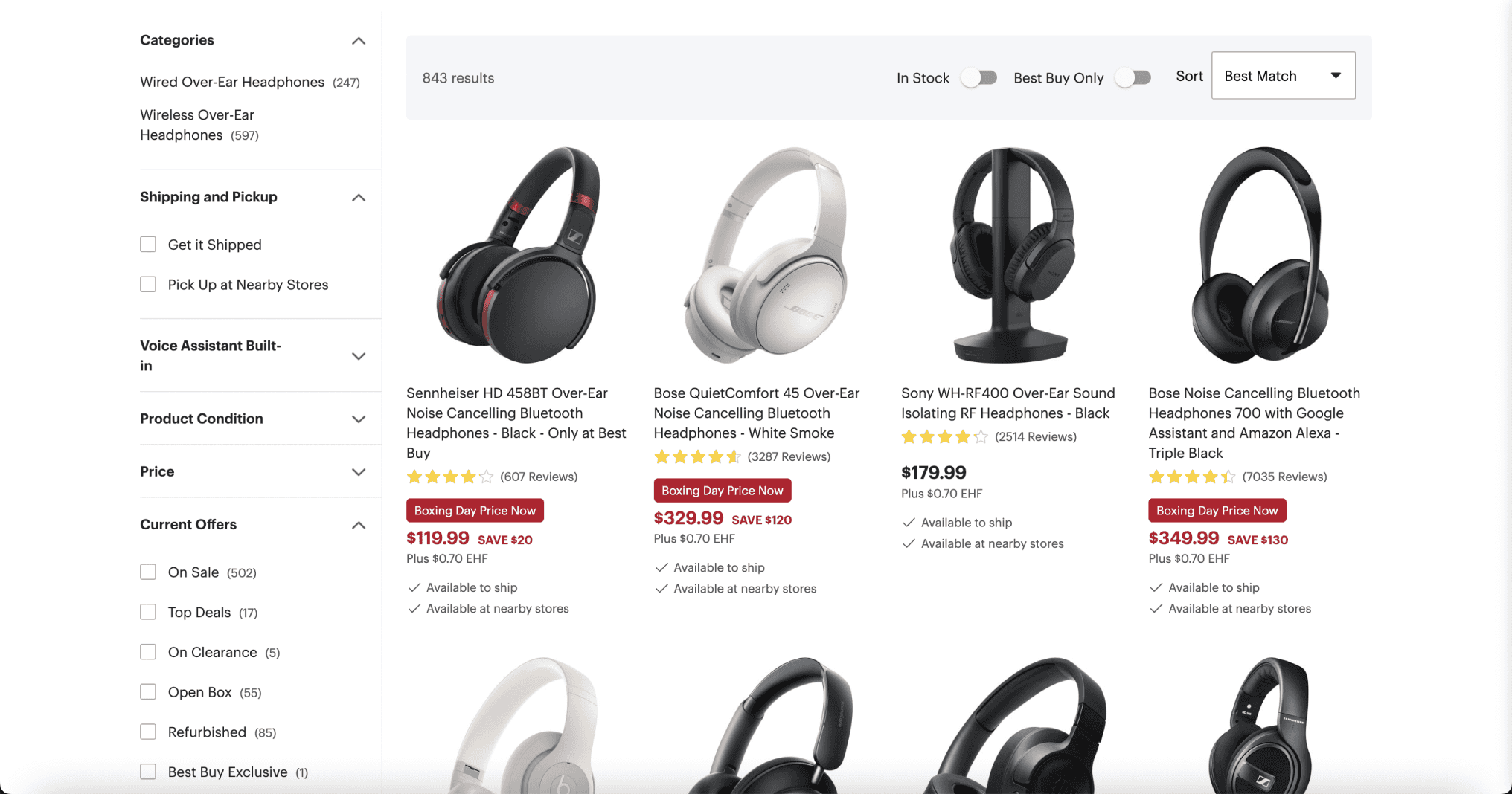
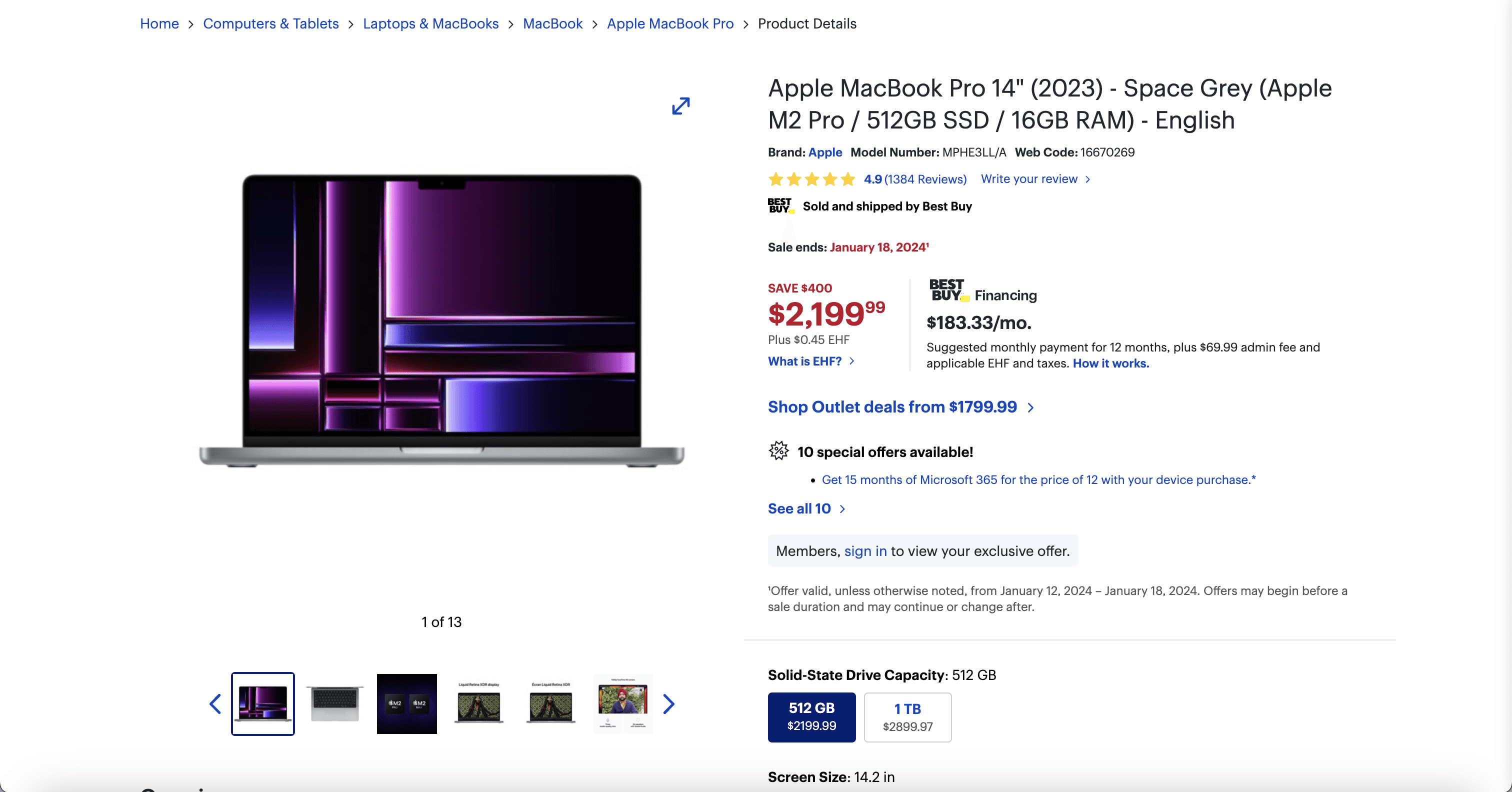
Product page details, naming conventions, layout inspiration.
Customer cart and checkout process inspiration.

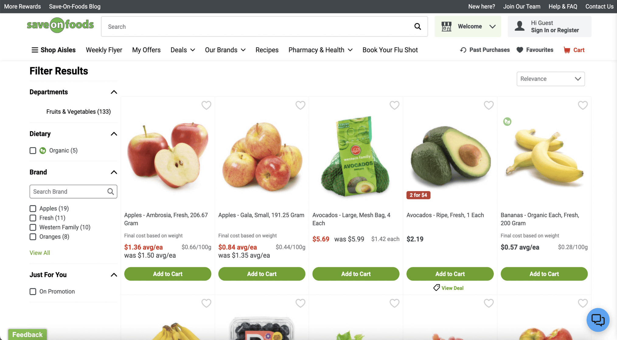
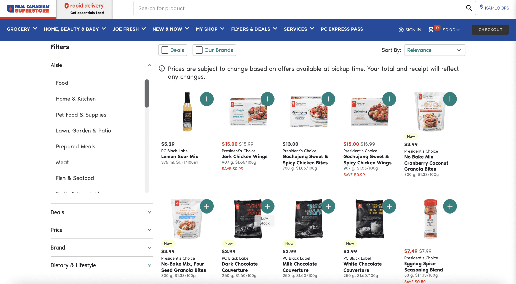
After analyzing Best Buy, I also decided to look at other e-commerce websites, but in other industries to see if there are any similar design conventions, so I decided to analyze two grocery stores: Save On Foods, Real Canadian Superstore
Website ReDesign
Before
After
Vancouver Laptops
Search for brands, devices, services...
Search
Profile
Cart (0)
The Best Sale Ever!
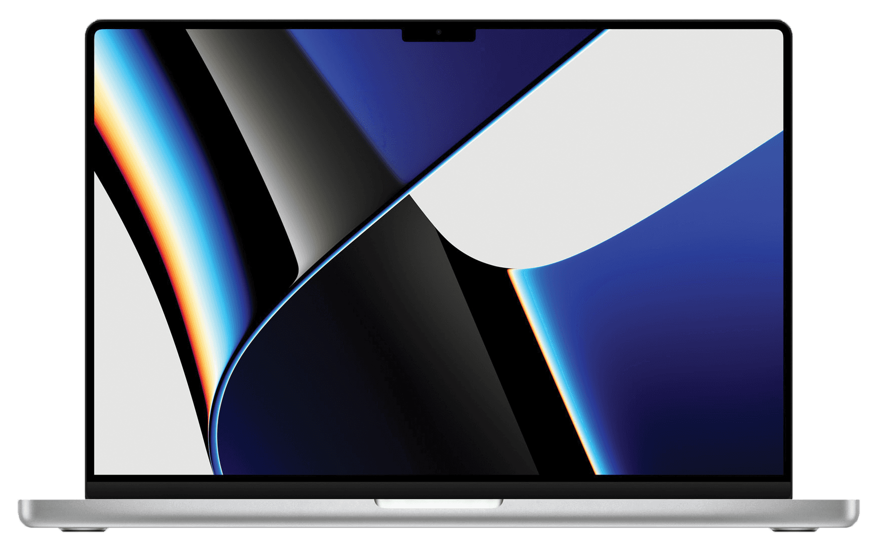
Refurbished laptops with unbeatable prices.
Shop Now
Need a Repair?
Connect with us, and get a quote with us now!
Find Out
Browse
Top
Deals
New Arrivals
Browse
Refurbished Laptops
Catalog
Clearance
Repairs
Data Recovery
Trade-In / Buy
About Us
Membership
Business Membership
Showing 1-8 of 51 Results
Sort: Price [Low - High]

Probook 8470p
HP
$149.00
$199.00
SAVE $50.00

VivoBook X512J
ASUS
$319.00
$349.00
SAVE $30.00
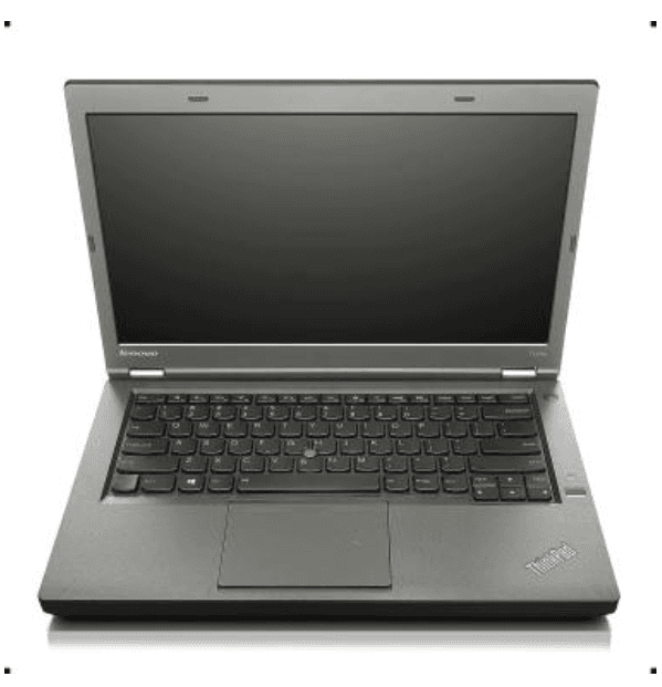
ThinkPad T440p
Lenovo
$329.00
$349.00
SAVE $20.00
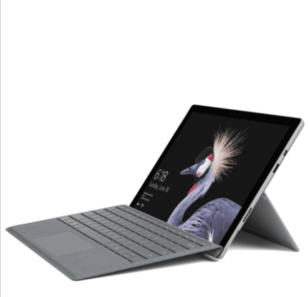
Surface Pro
Microsoft
$299.00
$399.00
SAVE $100.00
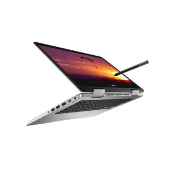
Inspiration P93G001 Touch Screen
Dell
$449.00
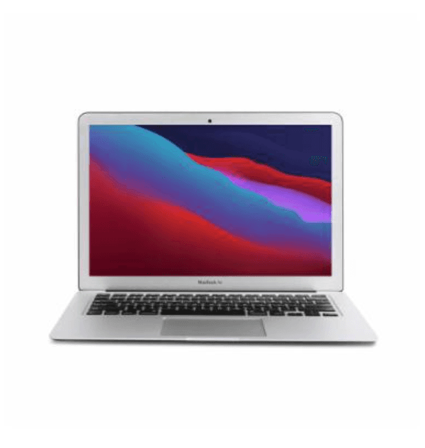
MacBook Air 13-inch 2015
Apple
$379.00
$399.00
SAVE $20.00
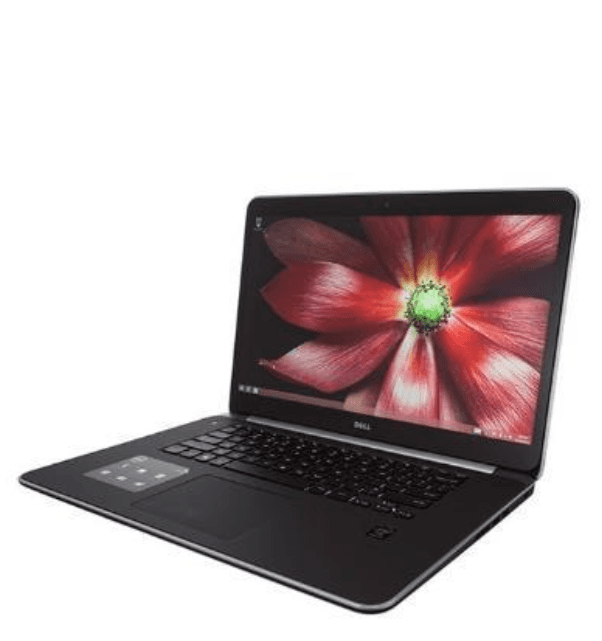
XPS 15 9530
Dell
$735.00
$789.00
SAVE $54.00
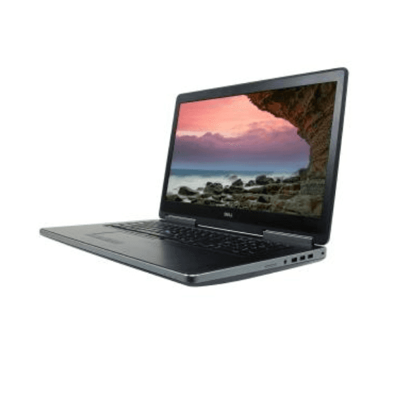
Precision 7710
Dell
$763.00
$899.00
SAVE $136.00
Filter
$99 - $349
(15)
$350 - $499
(10)
$500 - $649
(4)
$650 - $999
(12)
$1000 - and up
(2)
Dell
(16)
HP
(8)
IBM - Lenovo
(7)
ASUS
(4)
Apple
(4)
Other
(3)
Price Range
Brand
Browse More
FAQ
Track Order
Customer Support
My Account
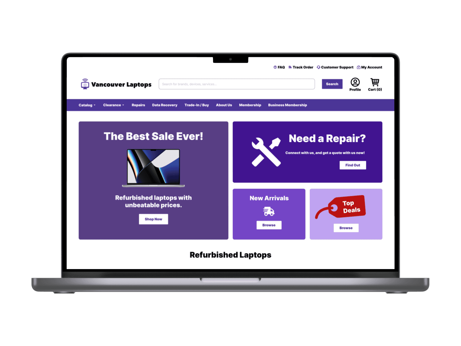
Recreated all interface elements for more cohesion.
Introduced a hero section with sales, offers, and promotions to guide the customer.
Expanded the placeholder text in the search bar for more guidance.
Adjusted spacing in between all page elements to better fit design conventions and in 4-point grids.
Adjusted product card sizing and product catalog to four product cards per line.
Re-designed and simplified product card details for better readability and cleaner page.
Re-designed the filter module into a fixed sidebar for better structure and organization.
Re-formatted the navigation top bar.
Before
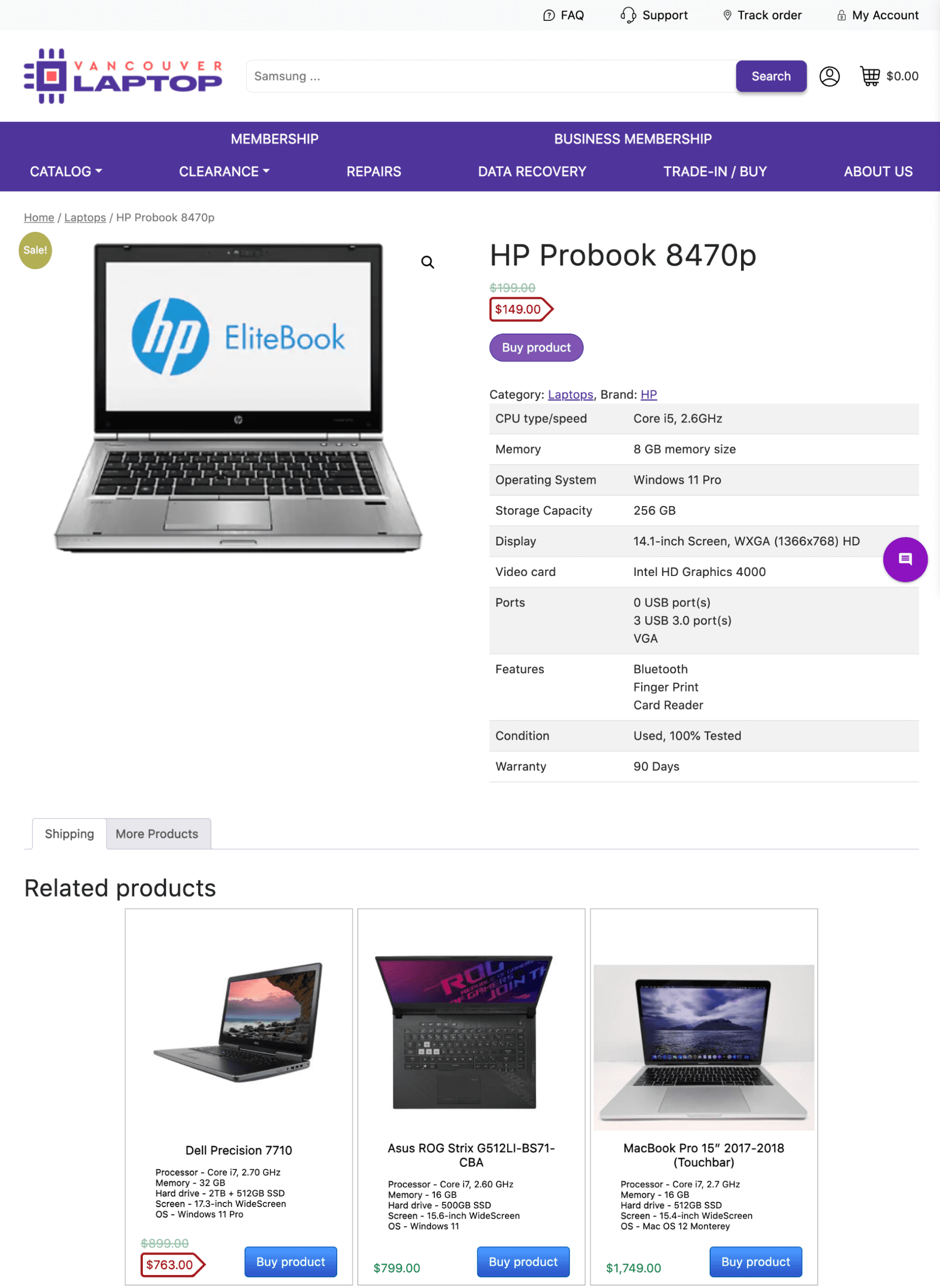
After
Home
Refurbished Laptops
Toshiba Satellite L635

Probook 8470p
Brand:
HP
Overview:
CPU Type/Speed
Memory
Operating System
Storage Capacity
Display
Video Card
Ports
Condition
Warranty
Core i5, 2.6 GHz
8 GB Memory Size
Windows 11 Pro
256 GB
14.1-Inch Screen, WXGA (1366x768) HD
Intel HD Graphics 4000
0 USB Port(s), 3 USB 3.0 port(s), VGA
Used, 100% Tested
90 Days
$ 149.00
$ 199.00
SAVE $ 50.00
Add to Cart
Similar Products

ROG Strix G512LI-BS71-CBA
ASUS
$799.00
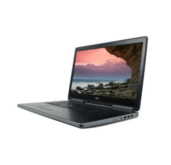
Precision 7710
Dell
$763.00
$899.00
SAVE $136.00
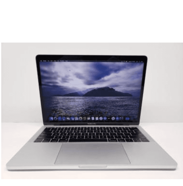
MacBook Pro 15” 2017-2018 (Touchbar)
Apple
$1749.00
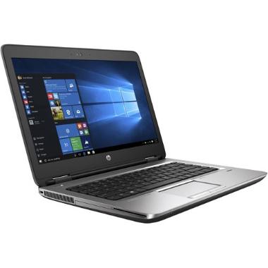
ProBook 645 G2 Notebook
HP
$235.00
$549.00
SAVE $314.00
Browse More
Vancouver Laptops
Search for brands, devices, services...
Search
Profile
Cart (0)
Catalog
Clearance
Repairs
Data Recovery
Trade-In / Buy
About Us
Membership
Business Membership
FAQ
Track Order
Customer Support
My Account
Reformatted and simplified product detail section for better usability and to fit industry best practices.
Enlarged main CTA “Add to Cart” button for better visibility.
Adjusted main CTA “Add to Cart” button colour to green to differentiate from other regular CTA buttons in purple.
Regular priced items listed in green, signalling a regular price.
Price-reduced items listed in red, signalling a sale price.
Adjusted spacing in between all page elements to better fit design conventions and in 4-point grids.
High Fidelity Prototype
Mobile Adaptation


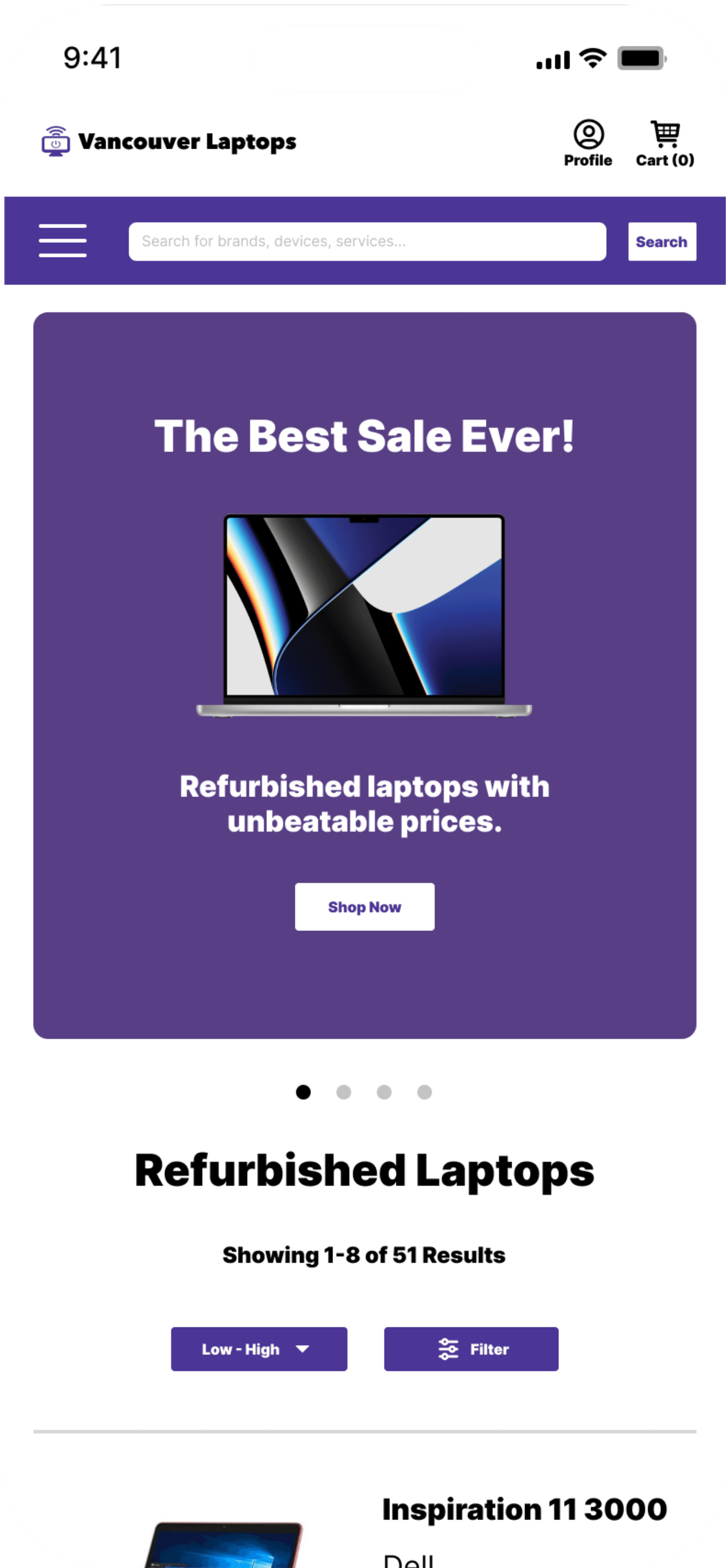


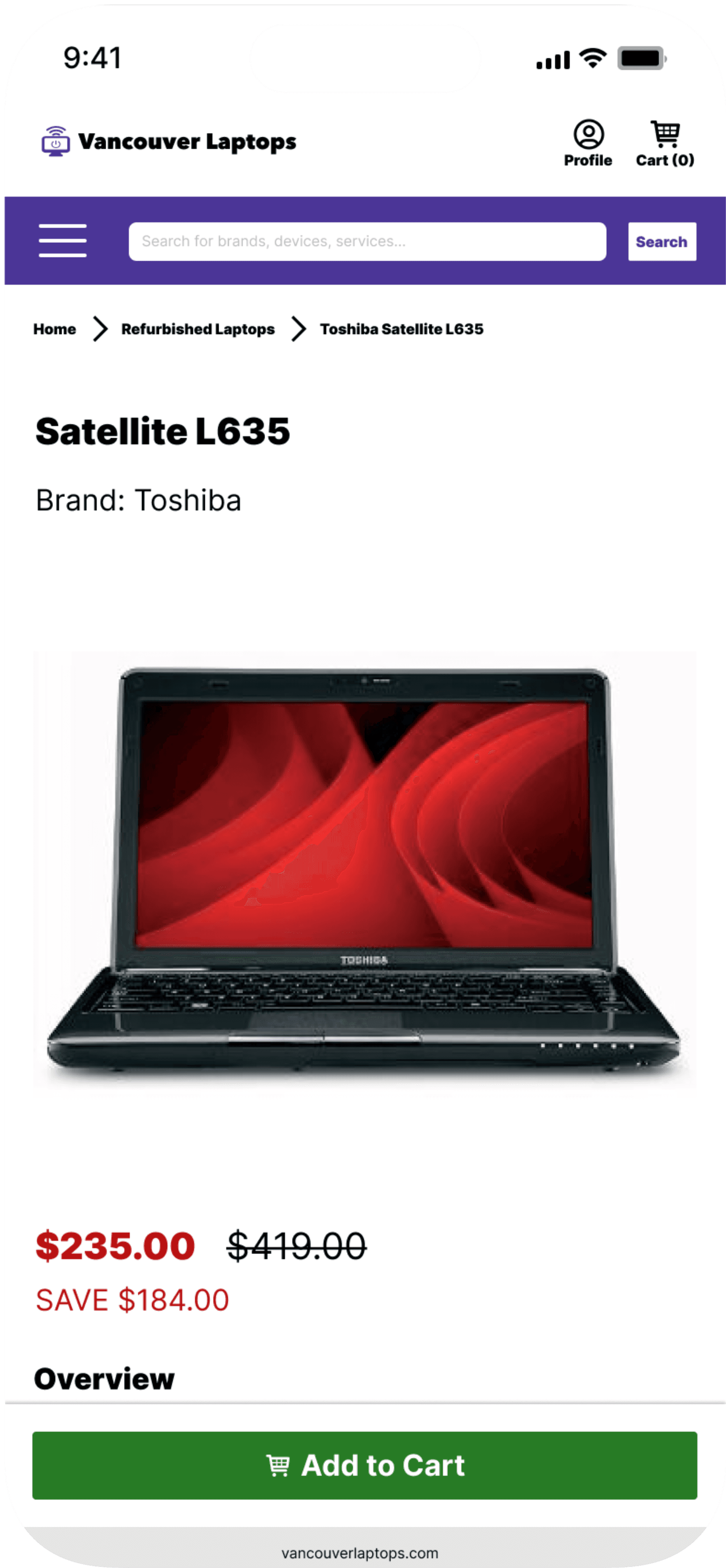


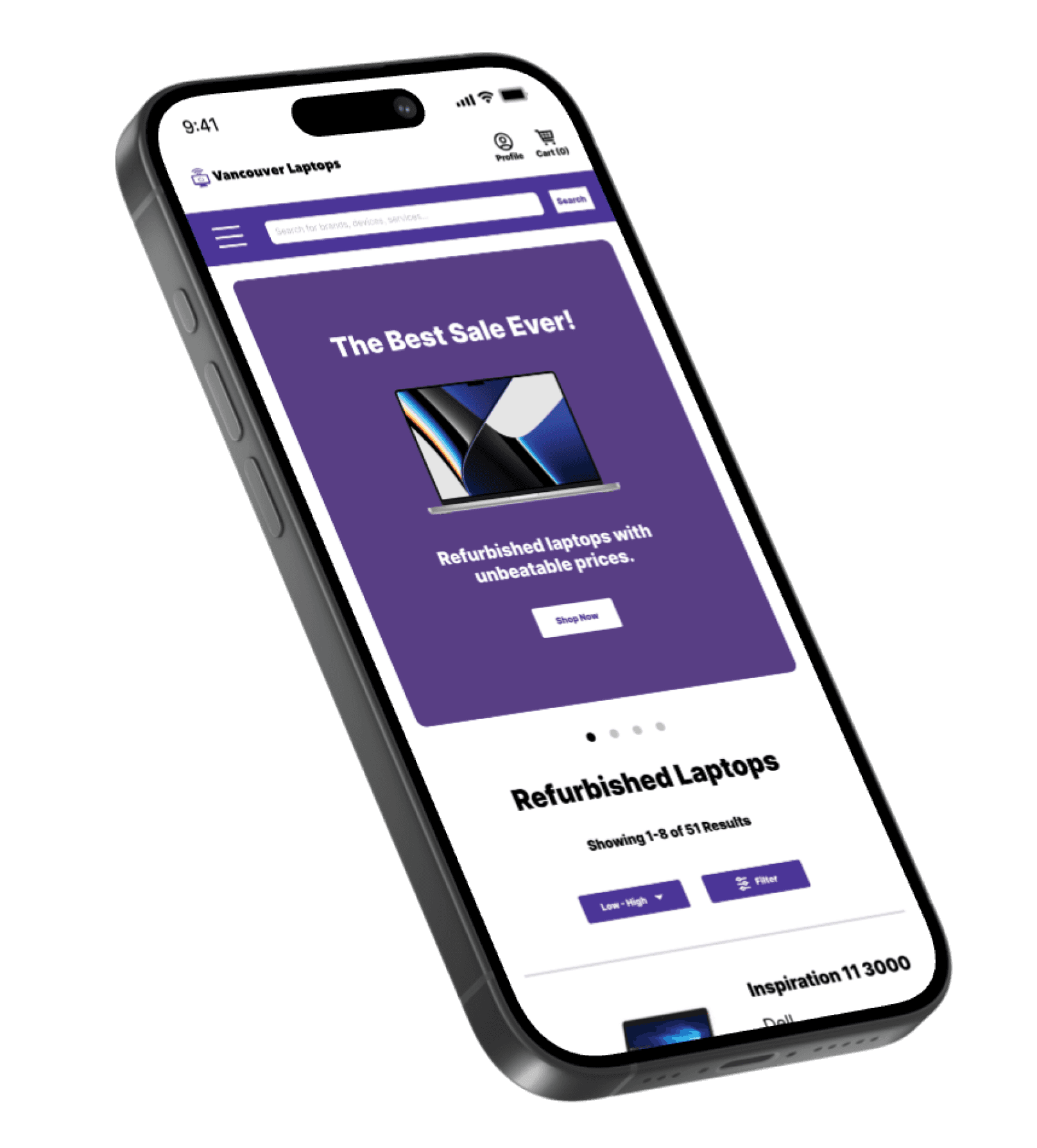
I then analyzed the same competitor’s mobile experience, adjusted the designs and prototype accordingly to demonstrate how the website would adapt to fit the mobile platform on the iOS.
Some noteworthy changes in mobile platform:
Hero section adapted into a sliding carrousel.
Items become more stacked for better view of each item one at a time.
Navigation bar is now a hamburger menu at the top that brings up an overlay.
Catalog filter is now a button before the catalog that brings up an overlay.
View Prototype
Next Steps
To further improve the usability and user experience of the website, here are the next steps I would take:
Complete and adapt the redesign for every single page on the website in both PC and mobile.
Collaborate with stakeholders and developers to ensure the designs are feasible and viable.
Conduct usability testing with real users and receive feedback to inform the next iterations of the website.
Continuously conduct market and competitor research to ensure the website is up to competitive standards.